How to Design Eye-Catching Acrylic Standees
In a world where visual branding and collectible merchandise are growing faster than ever, acrylic displays have become a powerful medium for creativity and promotion. Whether you’re an artist, marketer, or business owner, learning how to design an eye-catching acrylic standee can make a huge difference in how your work is perceived. A well-designed standee doesn’t just display an image—it tells a story, builds identity, and captures attention instantly.
Designing an effective acrylic standee is not just about placing an image on a clear sheet. It requires thoughtful planning, strong visual hierarchy, and an understanding of how physical display interacts with digital artwork. Let’s explore the essential steps and principles that help you create standout acrylic standees that truly shine.
Understand the Purpose Before You Design
The first step in designing a successful acrylic standee is understanding its purpose. Are you creating it for branding, merchandise, decoration, or promotional use? Each goal requires a different design approach.
For example, a corporate standee should focus on clarity, logo visibility, and professional aesthetics. On the other hand, a fan-based or character standee can be more expressive, colorful, and dynamic. Knowing the purpose helps you choose the right colors, composition, and style from the beginning.
Choose High-Quality Artwork
The foundation of any great acrylic standee is high-resolution artwork. Since acrylic printing enhances sharpness and transparency, any flaws in the design become more noticeable.
Always use vector files or high-resolution PNG images to avoid pixelation. If you’re designing characters or illustrations, ensure that the outlines are clean and colors are well-defined. Avoid overly complicated backgrounds unless they add meaningful depth to the design.
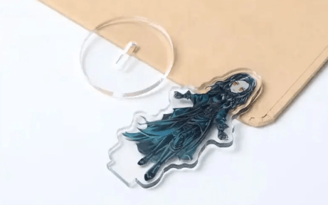
A strong visual subject with clear edges works best, especially when the standee is cut into custom shapes.
Focus on Shape and Cut Design
One of the most important aspects of designing an acrylic standee is the cut shape. Unlike traditional prints, acrylic standees are often die-cut into custom outlines that match the character, logo, or object.
When designing, always consider how the final cut will look. Avoid thin or fragile extensions that may break easily. Instead, aim for balanced shapes with enough structural stability.
For example, if you’re designing a character, ensure that hair strands or accessories are not too thin. A strong silhouette improves both durability and visual impact.
Use Color Contrast Wisely
Color plays a huge role in making your standee visually appealing. Acrylic material naturally enhances brightness and clarity, so your colors should be chosen carefully.
High contrast combinations—such as dark outlines with vibrant inner colors—work particularly well. They help the design stand out even from a distance.
If the background is transparent (which is common for acrylic standees), make sure your subject doesn’t blend into the surroundings. Outlines, shadows, or glow effects can help separate the design from the base surface.
Add Depth with Layering Effects
One of the most advanced techniques in standee design is layering. Instead of printing everything on a single flat surface, you can create multiple layers of acrylic to produce a 3D effect.
For example, foreground elements like characters can be placed on one layer, while background elements like scenery or patterns are placed behind them. This adds depth and makes the design more engaging.
Layering is especially effective for collectibles, anime characters, and premium branding displays where visual richness is important.
Typography and Logo Placement
If your design includes text or branding, typography must be carefully planned. Fonts should be bold, readable, and appropriate for the theme.
Avoid overly decorative fonts that reduce readability. Instead, use clean and modern typography for professional designs or stylized fonts for creative artwork.
For brand-related standees, always ensure the logo is clearly visible and not overshadowed by other design elements. Placement matters—central or top-focused positioning often works best for visibility.
Optimize for Printing and Production
Designing for digital screens is different from designing for physical production. Acrylic printing requires attention to bleed areas, cut lines, and resolution settings.
Always include a margin for trimming to avoid cutting off important details. Work in CMYK color mode if possible, as it provides more accurate print results compared to RGB.
It’s also important to check how transparent areas will appear when printed. Some colors may look different on clear acrylic compared to a white background.
See also: Custom Ornaments: The Perfect Way to Celebrate Life’s Special Moments
Test Your Design Before Final Production
Before sending your design for mass production, always test a sample or preview mockup. This helps you identify issues like color imbalance, weak cut points, or readability problems.
Many designers create digital mockups to visualize how the final acrylic standee will look in real life. This step ensures that the final product meets expectations and reduces production errors.
Keep It Simple but Impactful
One of the biggest mistakes designers make is overloading the standee with too many elements. Simplicity often leads to stronger visual impact.
A clean design with a clear focal point is more effective than a cluttered composition. Whether it’s a character, logo, or product, make sure the viewer’s attention is immediately drawn to the main subject.
Minimal but bold designs tend to perform best in both branding and collectible markets.
Final Thoughts
Designing an eye-catching acrylic standee is a creative process that combines art, precision, and technical understanding. From selecting high-quality artwork to optimizing shape, color, and layering, every detail plays a role in the final outcome.
When done right, an acrylic standee becomes more than just a display—it becomes a visual experience that captures attention and leaves a lasting impression. Whether you are designing for business promotion or personal creativity, focusing on clarity, balance, and visual impact will ensure your standees truly stand out in any setting.